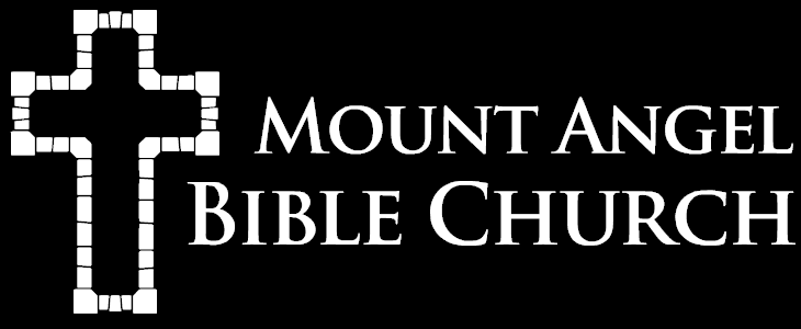
In simple terms a logo is a graphical symbol that represents something to those who may have limited knowledge of that something. In the case of MABC, our logo represents a local expression of Christ’s body in Mount Angel, Oregon…which is a very special something that cannot be represented adequately by a mere symbol.
In other words, no logo can be perfect. OK, then: what sort of characteristics make a logo a good logo?
- simple: “do one thing well” – if a logo is trying to accomplish too much, it won’t do any of those things well
- versatile: a good logo will be legible at small sizes, look good in color & monochrome applications, and have variations that work in a wide variety of contexts (e.g. bulletin, website, icon, letterhead, shirts, etc.)
- expressive: a logo should have a meaningful connection to the something it represents
What Our New Logo Expresses

As we thought about what MABC’s new logo should express, we wanted to keep Christ in the foreground. At the same time we wanted to allude to the relationship that believers have with Christ and with one another through through him:
And coming to Him as to a living stone which has been rejected by men, but is choice and precious in the sight of God, you also, as living stones, are being built up as a spiritual house for a holy priesthood, to offer up spiritual sacrifices acceptable to God through Jesus Christ.
1 Peter 2:4-5, NASB
The stones that make up the outline of the cross draw attention to the cross itself, which is captured in the negative space between the stones. The stones at the corners of the outline are slightly larger, giving the cross an old-world Reformation feel without resembling the ornate stylized crosses of the Catholic or Orthodox traditions. There are several different shapes and sizes of stones arranged in a way that is not perfectly symmetrical, serving their own particular purpose and symbolizing the diversity and unity of the Church:
For just as we have many members in one body and all the members do not have the same function, so we, who are many, are one body in Christ, and individually members one of another. Since we have gifts that differ according to the grace given to us, each of us is to exercise them accordingly: if prophecy, according to the proportion of his faith; if service, in his serving; or he who teaches, in his teaching; or he who exhorts, in his exhortation; he who gives, with liberality; he who leads, with diligence; he who shows mercy, with cheerfulness.
Romans 12:4-8, NASB
The typeface is called Trajan Pro (Bold) and it combines clean and modern lines with a distinctive look reminiscent of ancient Rome. It’s serious without being too serious, achieving a balance between formal and approachable. It’s a fitting choice for a church that seeks to represent Christ — described in John’s Gospel as “full of grace and truth” — to our culture.
